Create A WebView-free Blog App with React Native Render HTML, Part III

This article is the part III of the Create a WebView-free Blog App with React Native Render HTML serie. See also Part I and Part II.
tip
The source code of this case study is available in the main branch of this
repo: jsamr/rnrh-blog. The enhanced
branch contains a few more features beyond this tutorial, such as a refined UI,
dark mode, caching with react-queries...
etc. You can try out the enhanced version right now with expo, see the
project page for instructions.
tip
If you have any question or remarks regarding this tutorial, you're welcome in our Discord channel.

Tap To Scroll Feature#
The Scroller Class#
We'll put all the scrolling logic in a Scroller class that we'll later use with hooks.
Create this new file: utils/Scroller.ts:
Below is a summary of each member in this class.
constructorThe constructor takes a
ScrollViewref to enable thescrollToEntrymethod.addSelectedEntryListenerA method to listen to selected entry changes. This will be useful in the table of content drawer to update the active entry on scroll.
removeSelectedEntryListenerA method to free a listener to selected entry changes.
registerScrollEntryA method to be used with
onLayoutin order to store the coordinates of each entry in the body of the article.handlersEvent handlers to be passed to a
ScrollViewcomponent. TheonScrollhandler will be used to update the selected entry in the table of content drawer.setOffsetA method to set the offset of the
headingscontainer. Because of the DOM structure offered by Docusaurus wich looks like:the computed headings tags coordinates will be relative to the
<div>rather then relative to theScrollViewcontent, and we need to adjust to that.scrollToEntryA method to imperatively scroll to the given entry name.
Sharing the Scroller in a React Context#
Let's start by creating a scroller context and export the relevant hook and provider:
Then we can provide a scroller instance from the ArticleScreen component,
and scroll to the targeted entry on menu entry press.
Finally, we must consume the scrollViewRef in the ArticleBody component,
and pass the Scroller.handlers event handlers to the ScrollView component:
Great! Nevertheless we have yet two unaddressed issues:
- Update selected entry on scroll in the
TOC; - Register headings layouts. We will use a custom renderer for that purpose.
Listening to Entry Changes in TOC#
First of all, I propose to factor the logic of adding a listener to
selected entry changes in a separate hook (hooks/useOnEntryChangeEffect.ts):
Then, we just need to consume this hook from the TOC component:
Register Headings Layouts#
The Scroller is still missing the coordinates of each heading to be able to
properly scrollToEntry. For this purpose, we are going to create a custom
renderer
for <h2> and <h3> tags. We will also need to register a <header> renderer
to store the header height. If you remember well, the DOM has a structure like
below:
Let's get back to components/WebEngine.tsx and register both renderers here:
Because the <h2>, <h3> and <header> tags have a content model set to
block, they will be rendered in a View, so we can pass onLayout in
viewProps prop.
Hence we're done with the tap-to-scroll feature! But the ArticleBody is still
pretty ugly, so we'll use some styles and fixes to prettify it!
Styling Refinements#
Fixing the Avatar#
The avatar should be 50x50 and its container displayed in row. We are going to fix it in two steps:
- By targeting the container class with styles to display in row;
- By setting a custom
<img>renderer to fix the size.
So let's edit the components/WebEngine to apply those fixes:
Fixing Paragraphs in <li> Elements#
Paragraphs nested in <li> elements have top and bottom margins, which is undesirable.
To fix the issue, we're going to add a custom <p> renderer like so:
note
We are using markers which contain the current nest level of ol and ul
elements to assess if we are rendering inside a list. See Markers.
Discard # anchors appended to Headings by Docusaurus#
These elements have a "hash-link" class, so we can use ignoreDomNode to discard them:
Great! Now the # characters have been removed:
However, code samples look pretty ugly:
- They're missing padding;
- They should be horizontally scrollable and lines should not wrap;
- A monospace font should be used;
- Whitespaces should be preserved.
So, let's fix it!
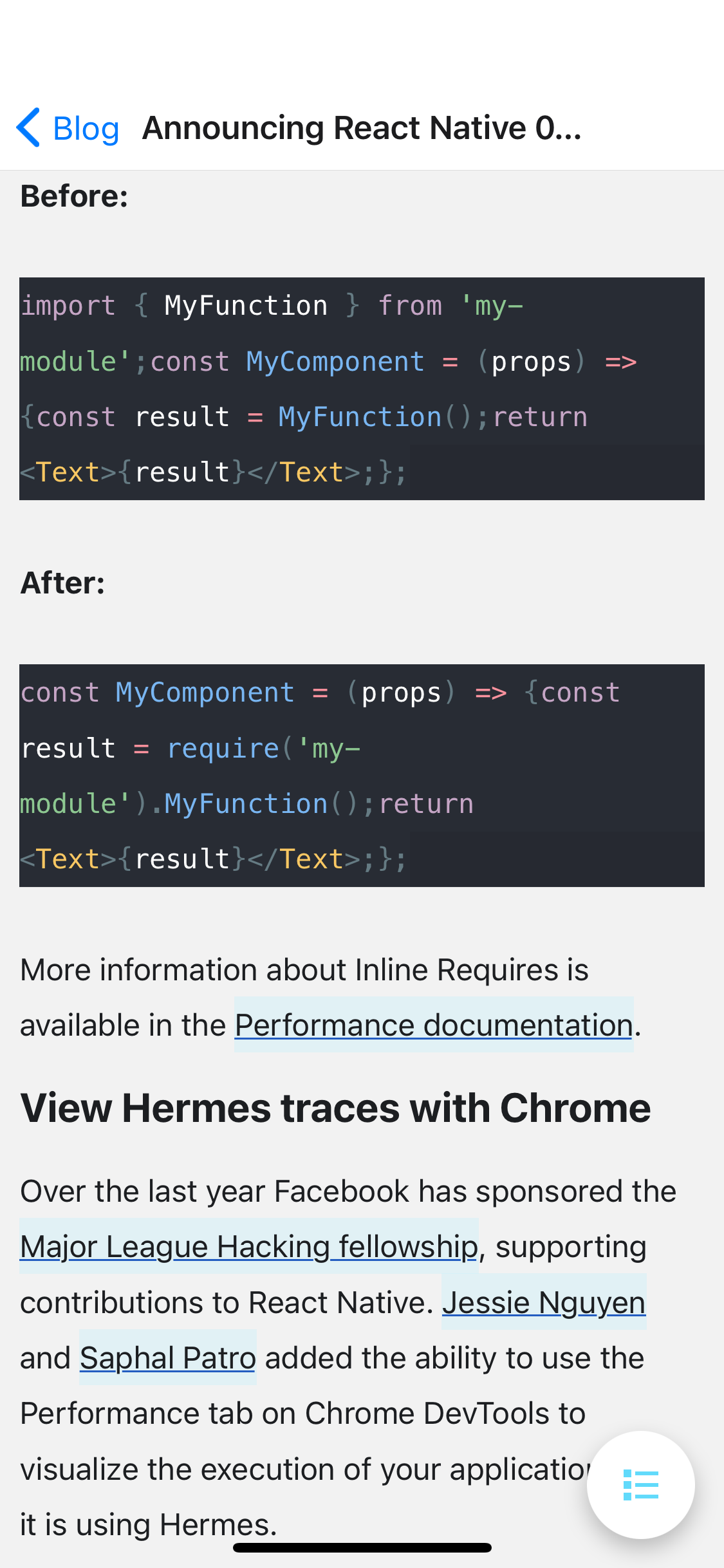
Fixing Code Samples#
Code samples are rendered by Docusaurus in a <pre class="prism-code"> tag. We need to fix two issues:
- Define a custom renderer for
pretags, which renders inside aScrollViewwhen matching the"prism-code"class. - Define a custom renderer for
spantags. We need to do that because the whole code block is rendered inside acodeelement with adisplay: flex; flex-direction: column. However,codeis translated to a React NativeTextsince his element model is textual. To work around this issue, we can inject line breaks after eachspanelement with a CSStoken-lineclass which content does not end with a new line.
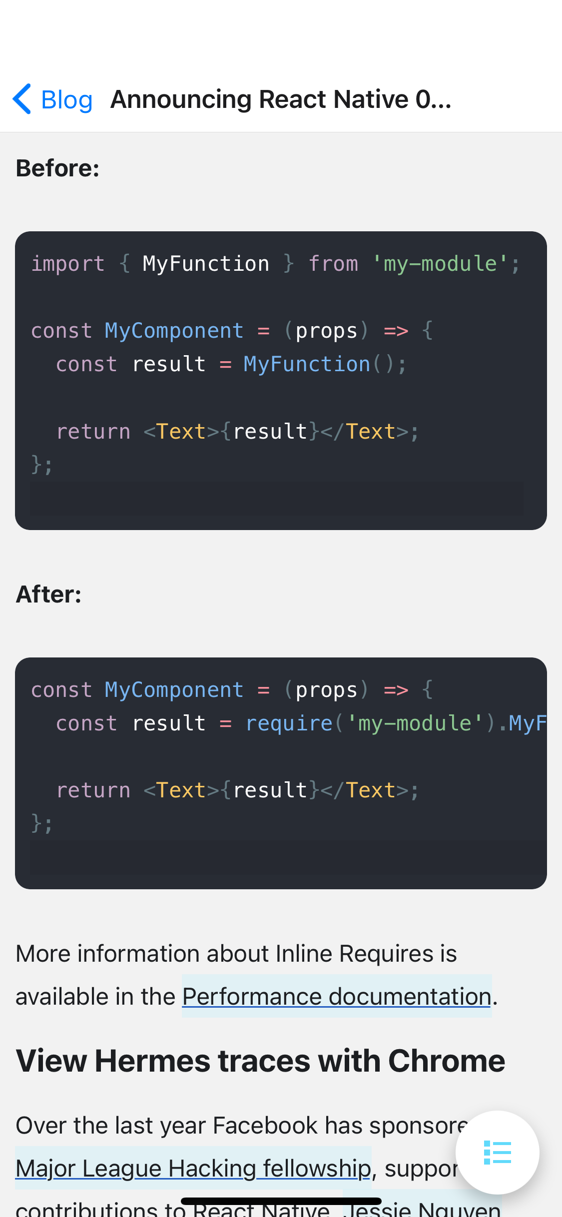
That's looking much better. We're almost done!
Final Touch#
We could add a few more styles to match the React Native blog styles:
Epilogue#
Frustrating React Native Text Limitations#
As a final note, I'd like to mention a few frustrating limitations in React Native that prevented me from replicating more accurately the official blog styles:
backgroundColorspans to the full line-box of text elements, whereas in CSS, it only spans to the text content-area. Below is a diagram explaining the difference: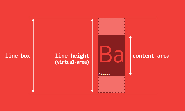 See a complete explanation in this excellent article on CSS text styling.
paddingandborderare ignored in nested text elements.
All these features are required to get the official blog appealing anchors styles:
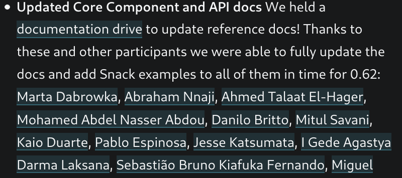
Instead we have backgrounds overlapping each other, which becomes weird when there is a high density of anchors:
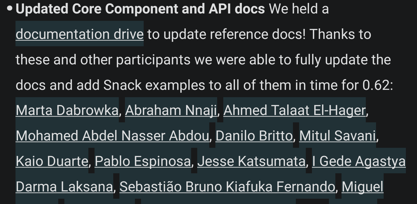
This is because, as stated before, the backgroundColor spans to the entire
height of the line box, instead of spanning to the content area.
Going Further#
You can take a look at the enhanced branch of the project and see how the
below features have been implemented:
- Cached queries with
react-queries; - Dark mode (follows system mode);
- Progressive rendering for fast time to first contentful paint via
FlatList; - Collapsible header with
react-native-reanimated(v2); - Video support with
expo-av.
That's all for this tutorial! Don't forget to give us a star if you enjoy this library. You can also follow me on Twitter, and rate this library on Open Base.
